
1/2


Kampala, Kawempe, 13/07
1 views
Professional Website Designing and Web Hosting
Joska Ventures Limited
Company Name
Graphics & Design
Type of Service
Website Design
Specialization
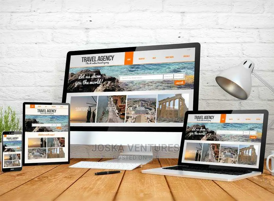
Responsive Web Design
Responsive web design is an approach that allows websites (and it’s pages) to render (or display) on all devices and screen sizes by automatically adapting to the screen, whether it’s a desktop, laptop, tablet, or smartphone. This delivers the best experience to users, whether they’re on their desktop, laptop, tablet, or smartphone.

Safety tips
- Check Feedback to make sure the person is reliable
- Agree on the scope of work and remuneration
- Meet in person at a safe public place


